Many of the original images have significant blemishes from dust, stray hairs, staining or degradation through age. Interestingly, some of the Rose postcards were reproduced in a rather slapdash fashion, with little attention paid to cleaning the original negative from which the prints were made. As a result, there are fingerprints, dust and hair blemishes on the images that are ‘baked in’ to the postcard, no matter how well it has been looked after since it was printed. There is a great deal that can be done by image processing but of course the processed image will no longer be a faithful reproduction of the original. In such cases, I suggest that the image be sensitively processed but also that the original scan be retained in case it is ever required. Zoner Photo studio (ZPS) allows one to process an image in a way that the original file remains unaltered. ZPS stores both the original and the edits performed during processing. When one displays the image in ZPS, it applies the edits and one can view both the processed image and the original with no information being lost. The processed images can be ‘developed’ into processed tiff or jpg files which can then be used for archiving or printing as required. For archiving to sites such as Victorian Collections, the society can choose which files to upload, unprocessed, processed or both. It should be noted that that even the unprocessed scans have been processed to some extent by the image scanning software but that is inevitable.
General Improvement
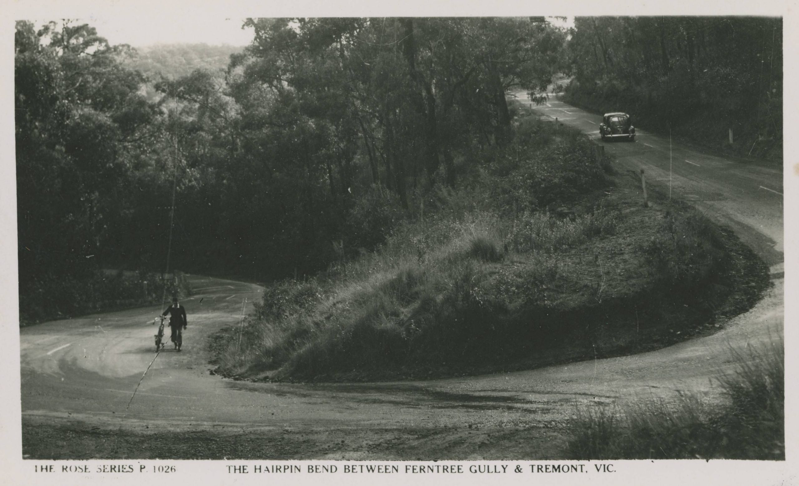
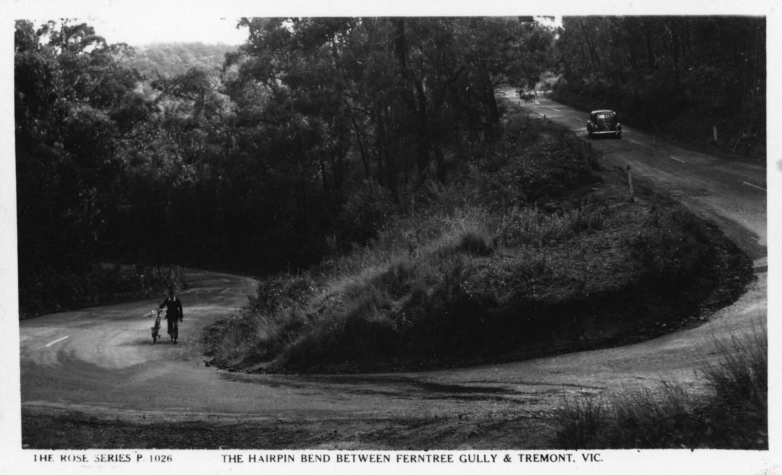
Annotations
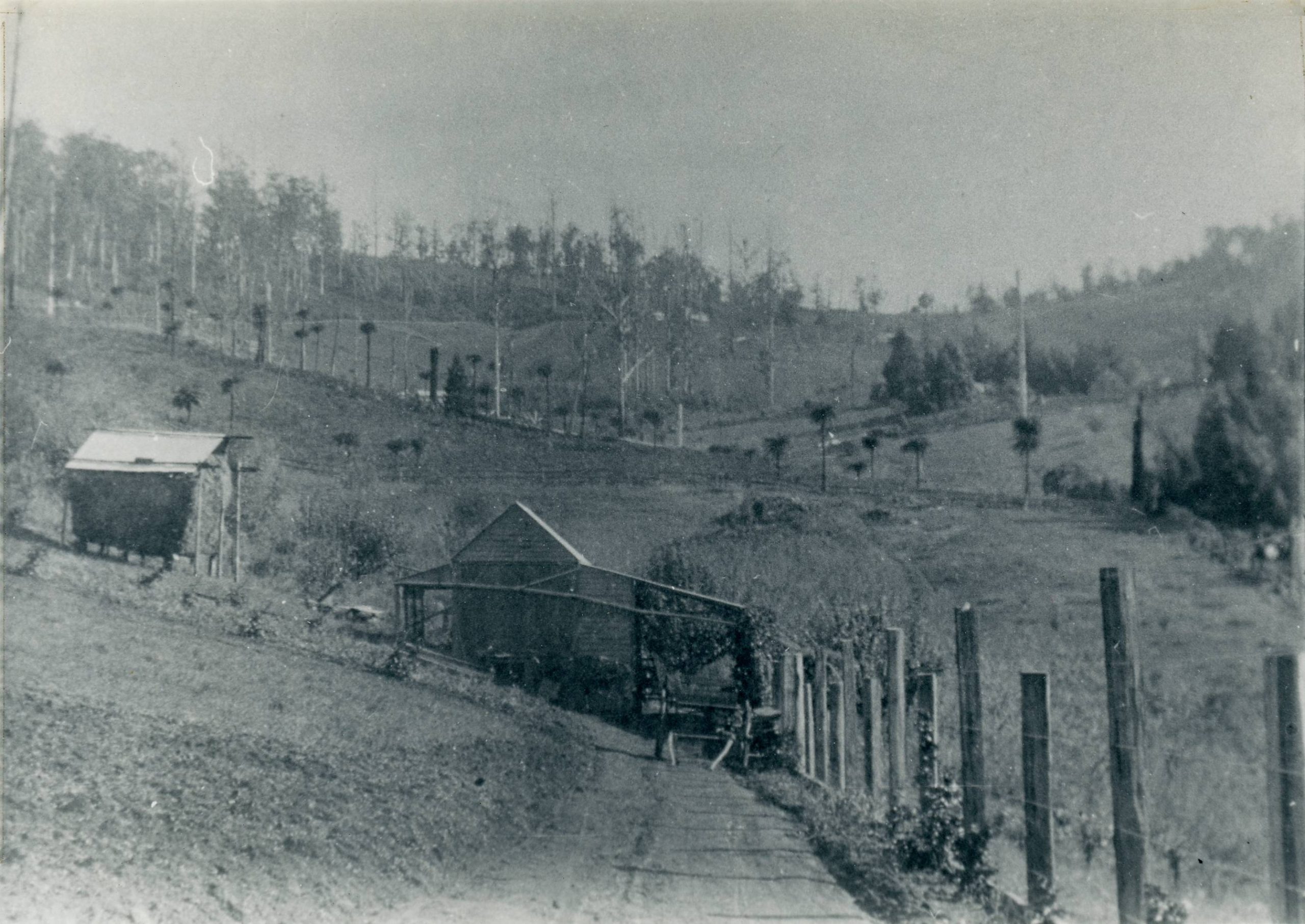
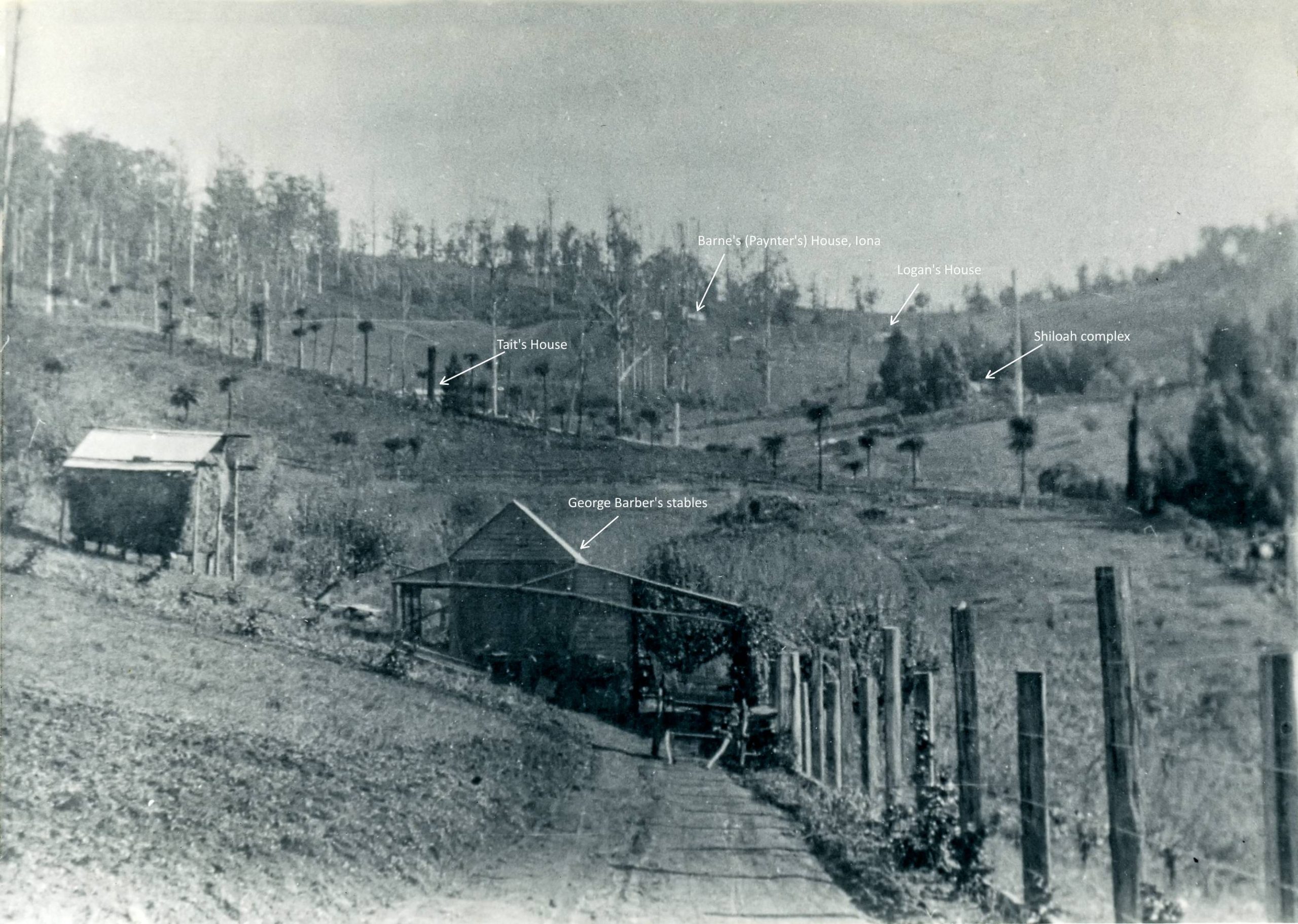
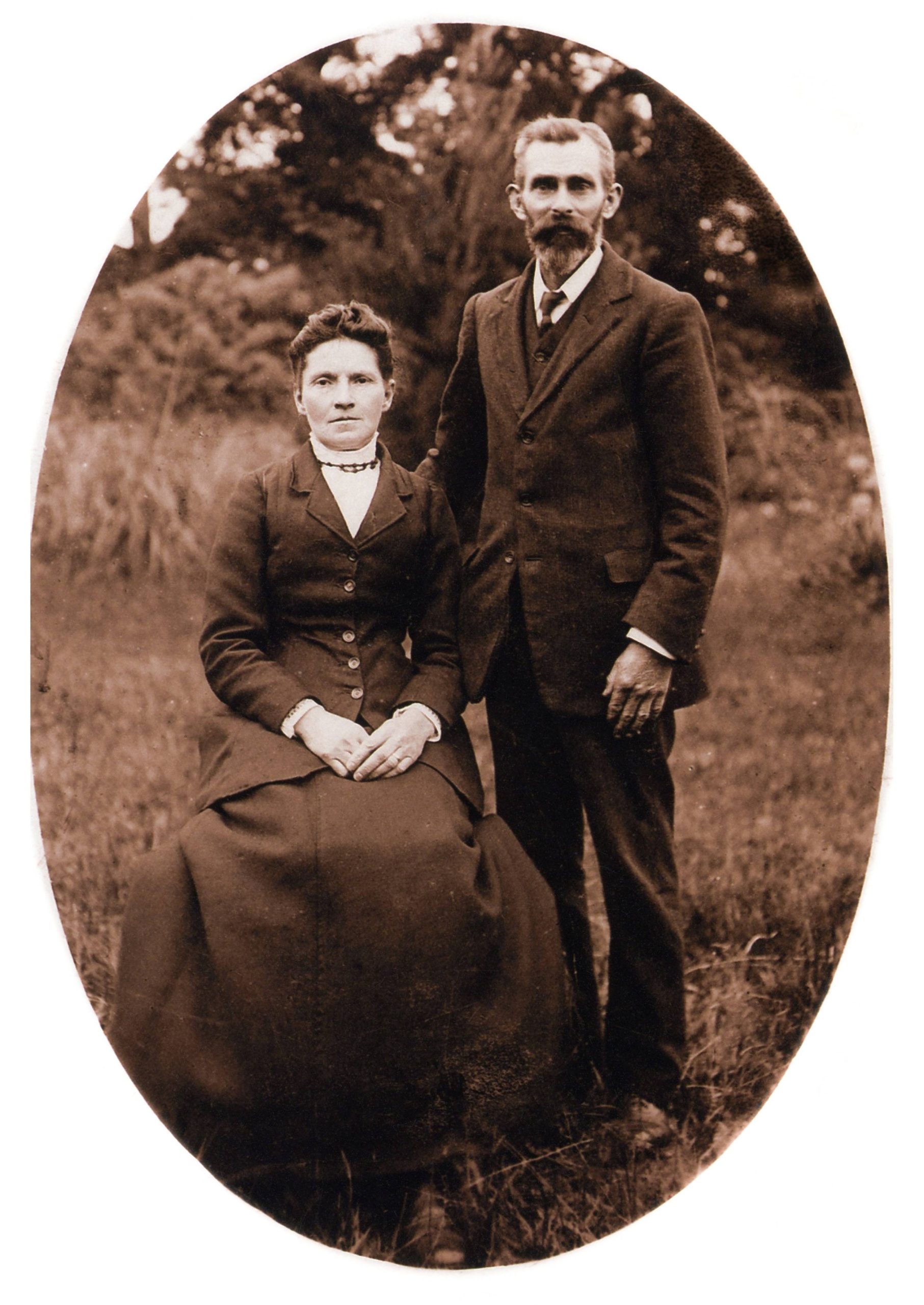
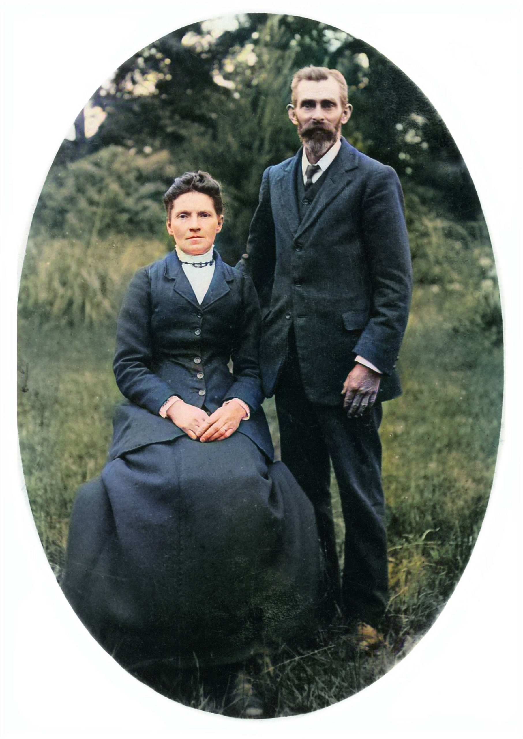
Adding Colour
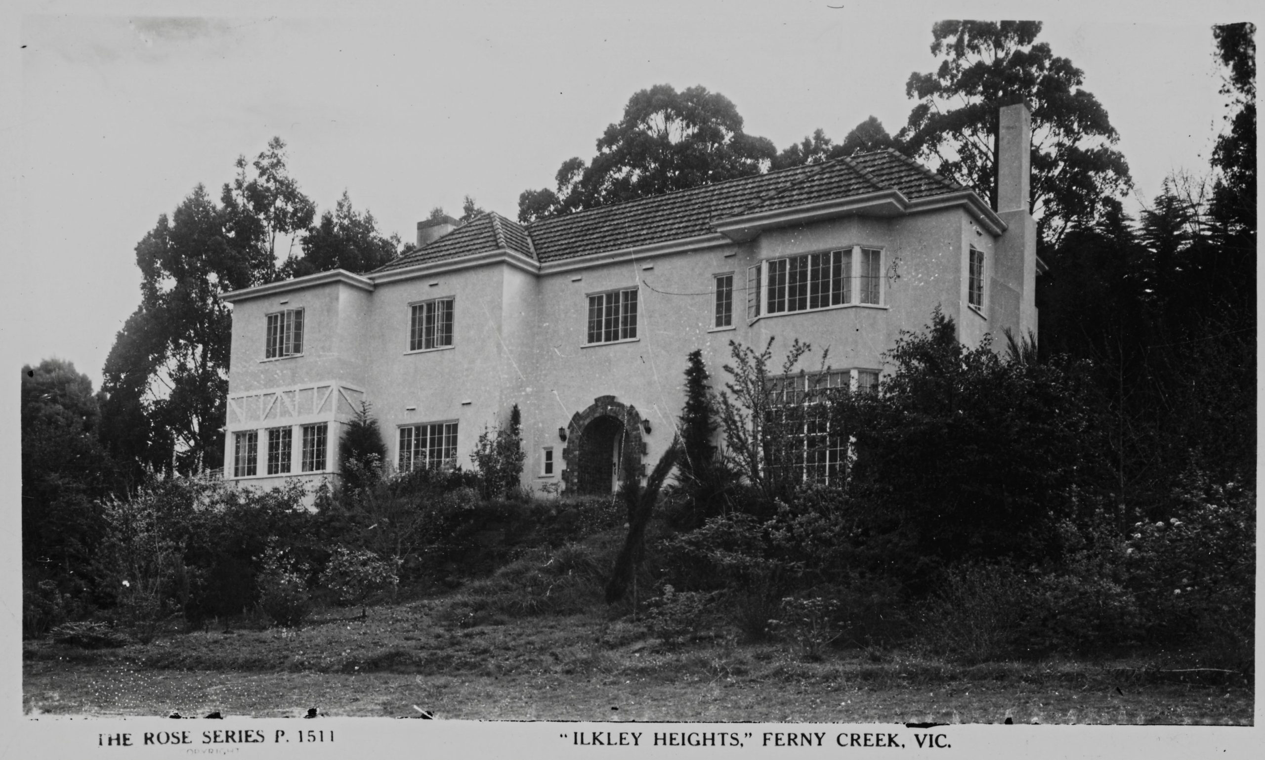
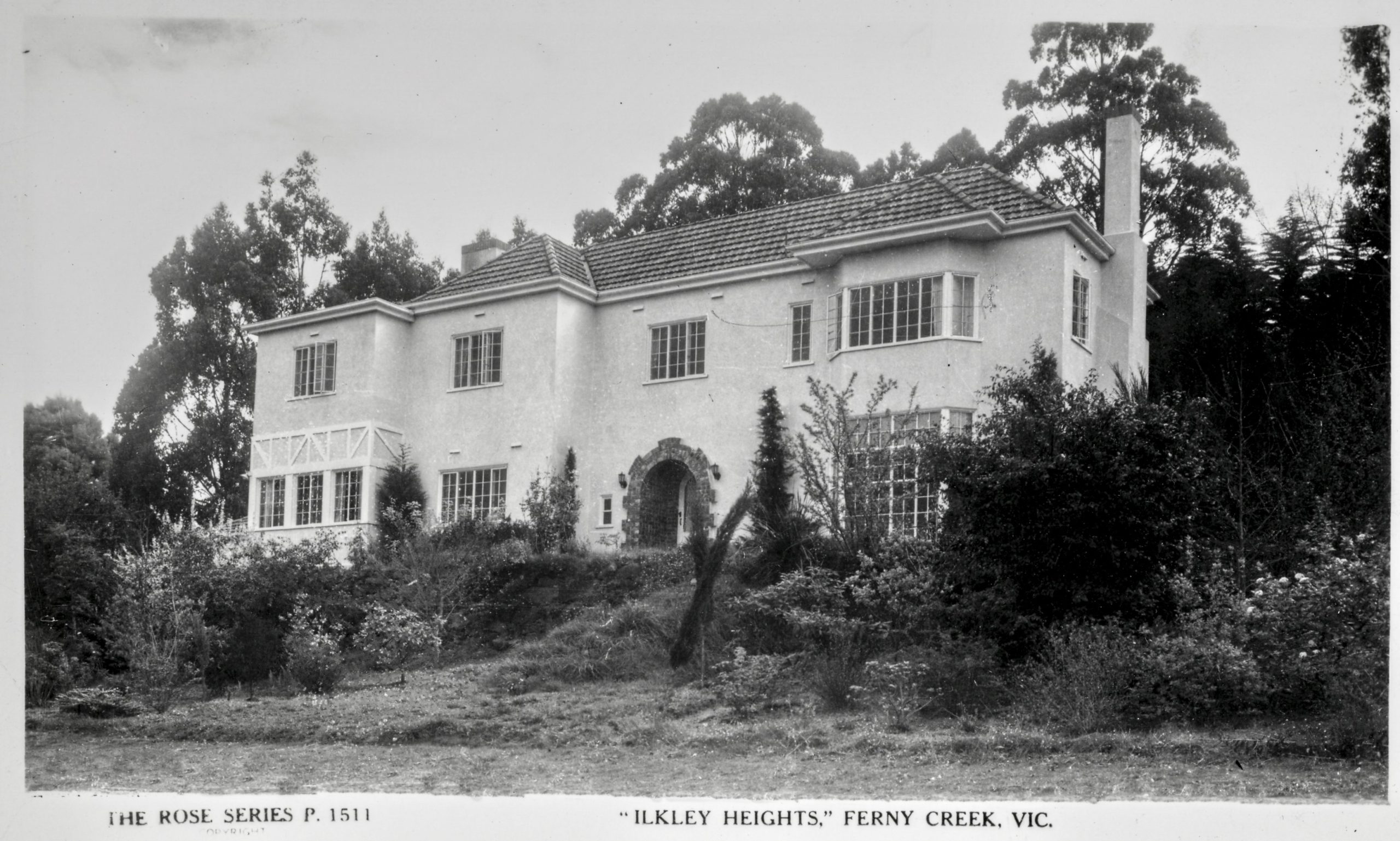
Example of fingerprints and scratches
The image of Ilkley Heights in Ferny Creek is an example of a badly printed postcard. When printing, the negative was scratched and had bad fingerprints. It proved difficult to improve. The result is below.
Major processing
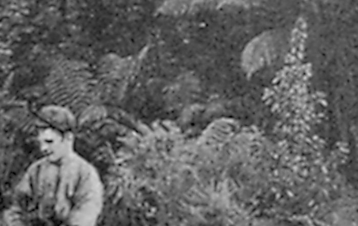
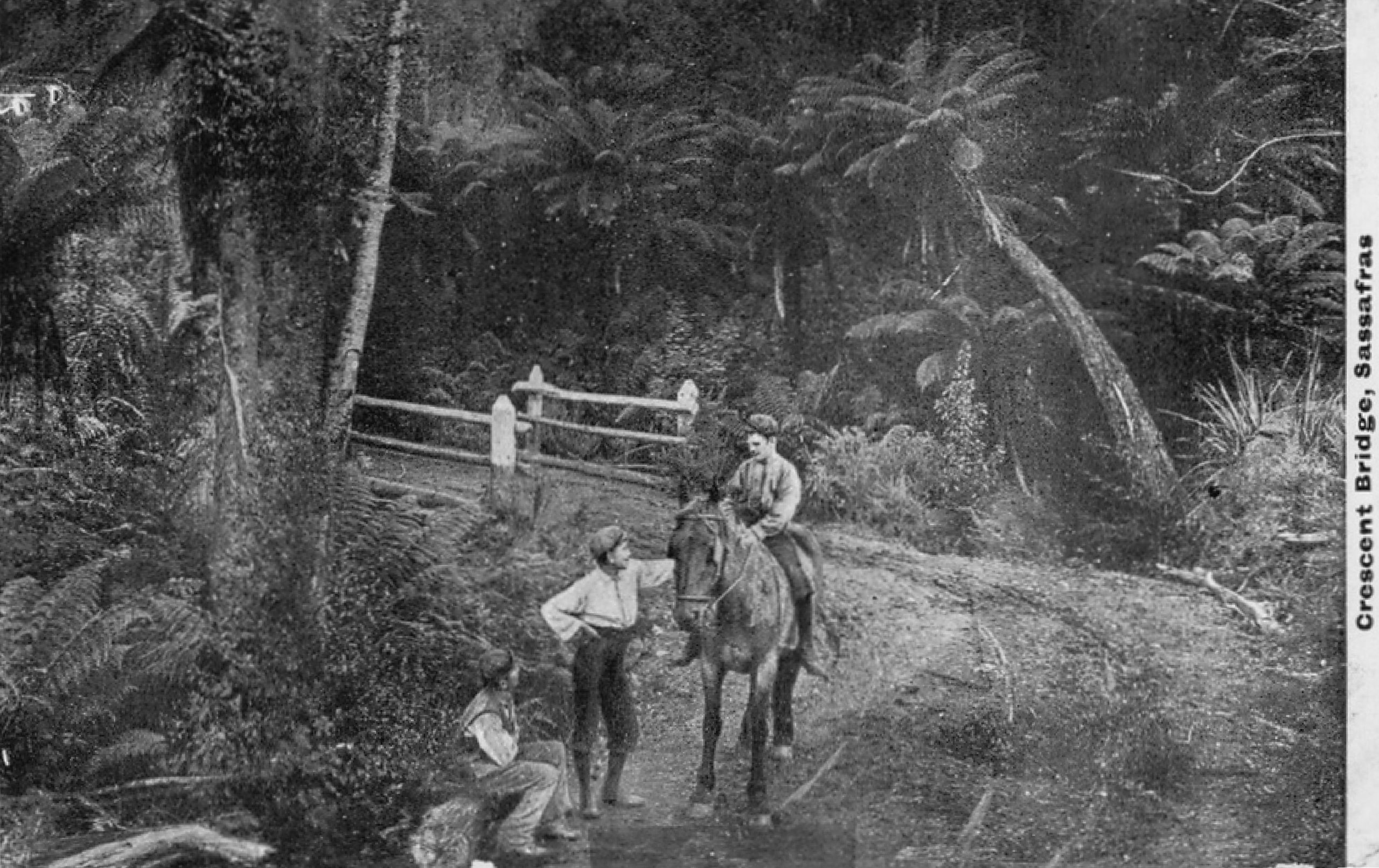
Most images require little processing to clean them up, but some require far more. A badly damaged example is the photo of Mountain Grange that you mentioned was of interest. Some of it on the right-hand edge was seriously damaged and did not appear to have much of interest, so I have cropped that part out. There is a tree fern in the image, just to right of where I have cropped it. When the photo was taken, photographic emulsions were less sensitive than they became later and so the exposure time was long. So long in fact that the tree on the extreme left and the tree fern, both of which were waving around in the wind, were subject to motion blur. The effect is visible in the original scanned image below.
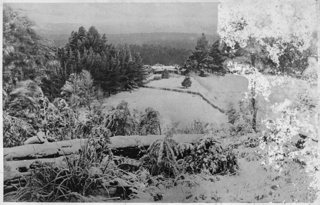
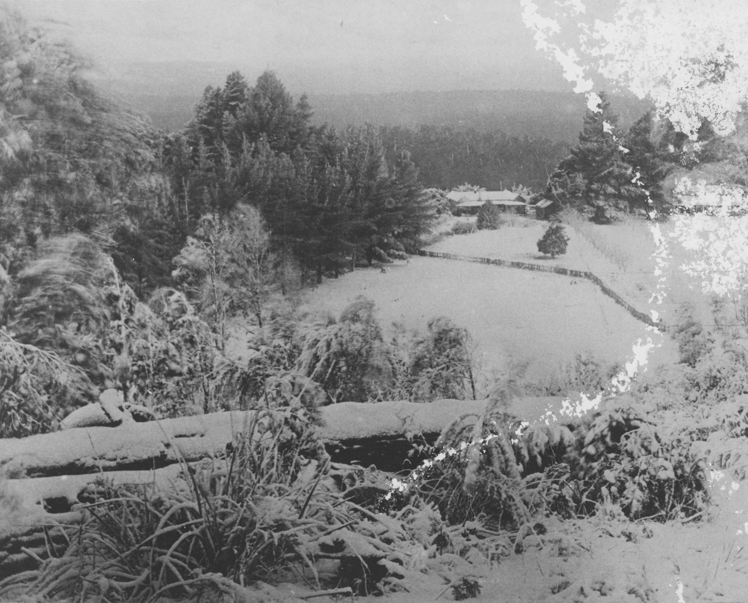
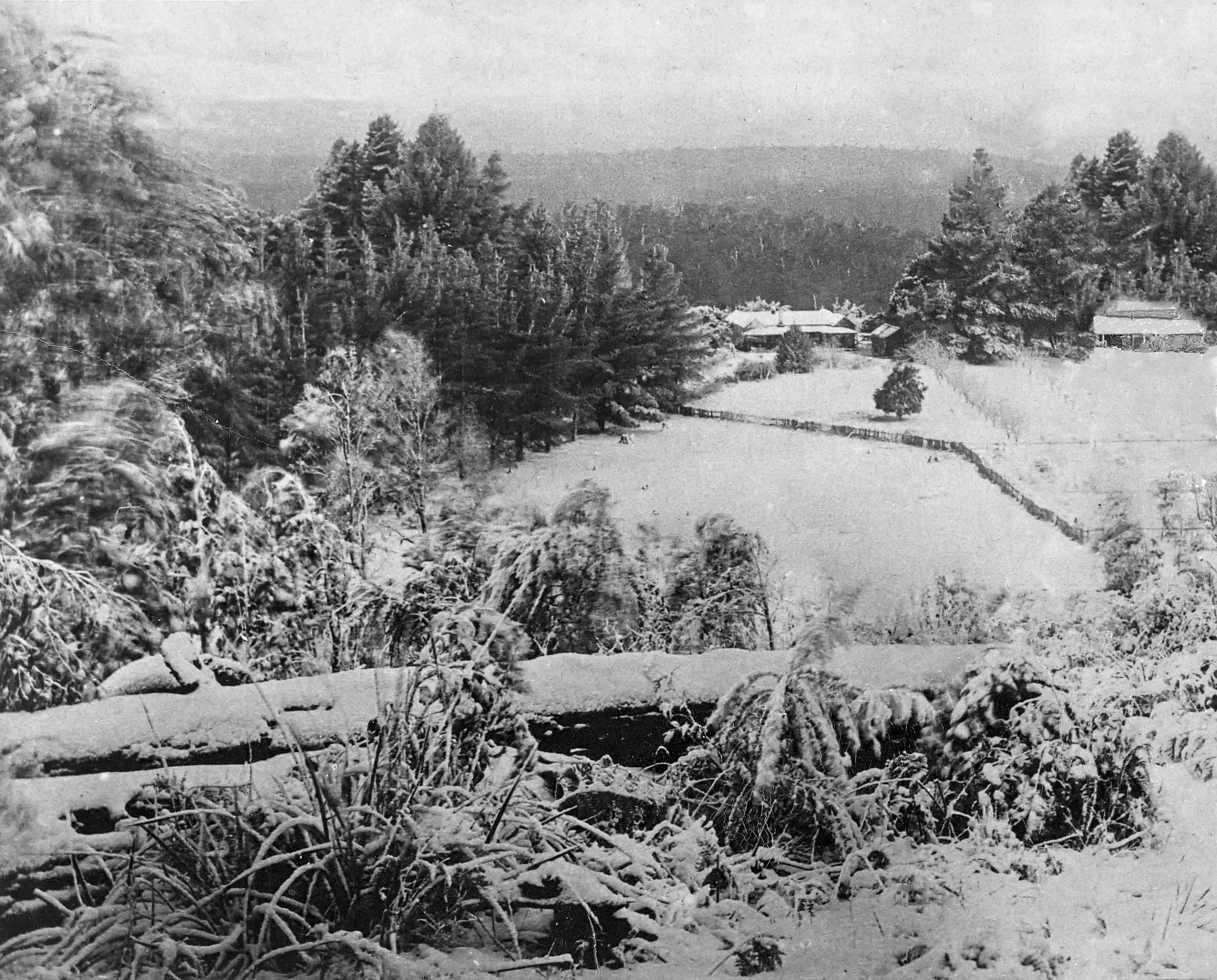
Tints
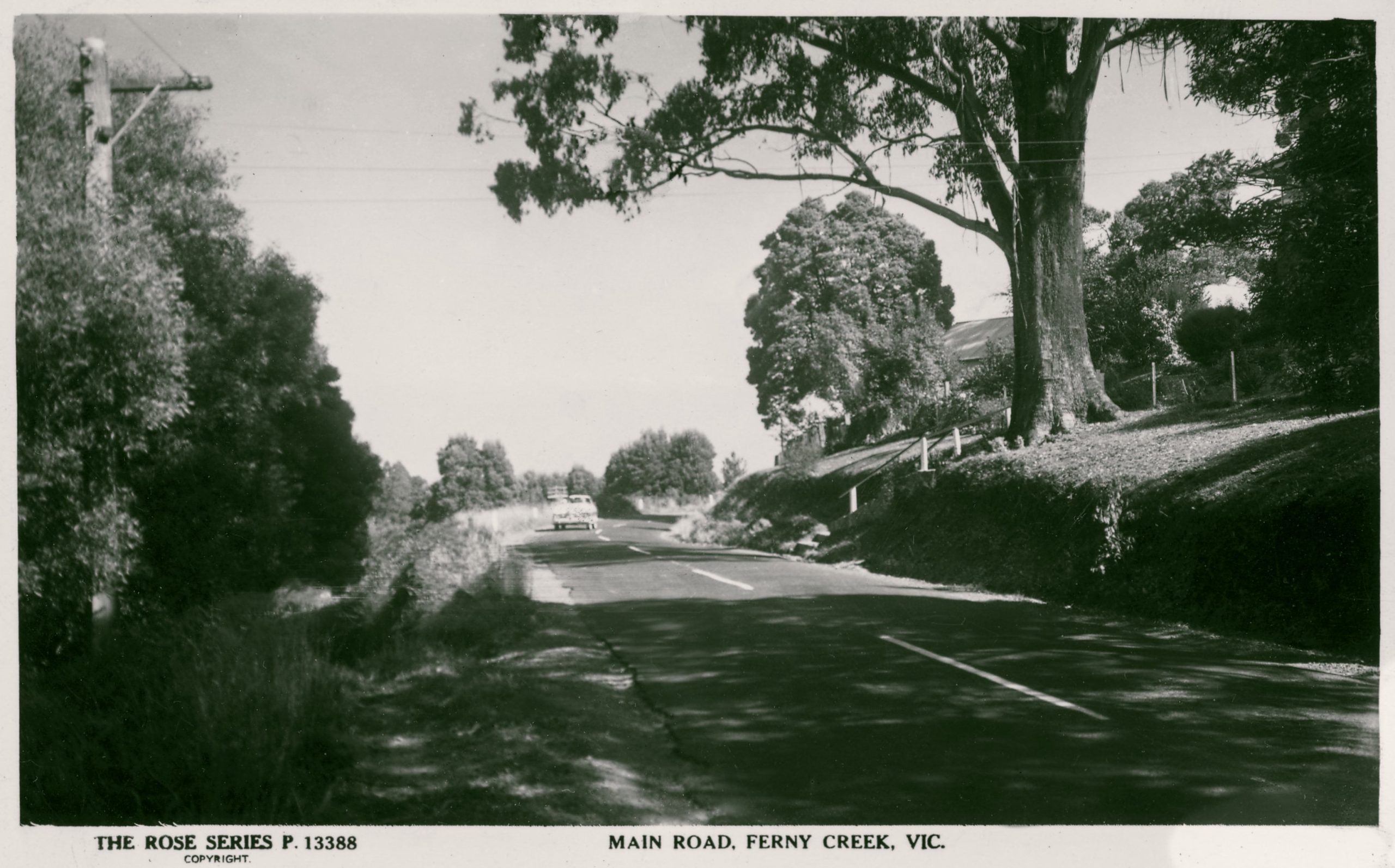
One issue that probably merits discussion is the question of the tint of the photograph. Depending upon the method used for printing the images, they may have a significant tint such as the traditional sepia tint. I mention this because when processing such images, it is much easier to deal with coloured staining by working on the image as a pure black and white image. When I do that, the tint is also removed. Shown below is a before and after comparison of a photo with colour staining. The brown stains at top middle and blue fingerprints at bottom right are removed on the processed image but the tint has also been removed and the result is a pure greyscale image.
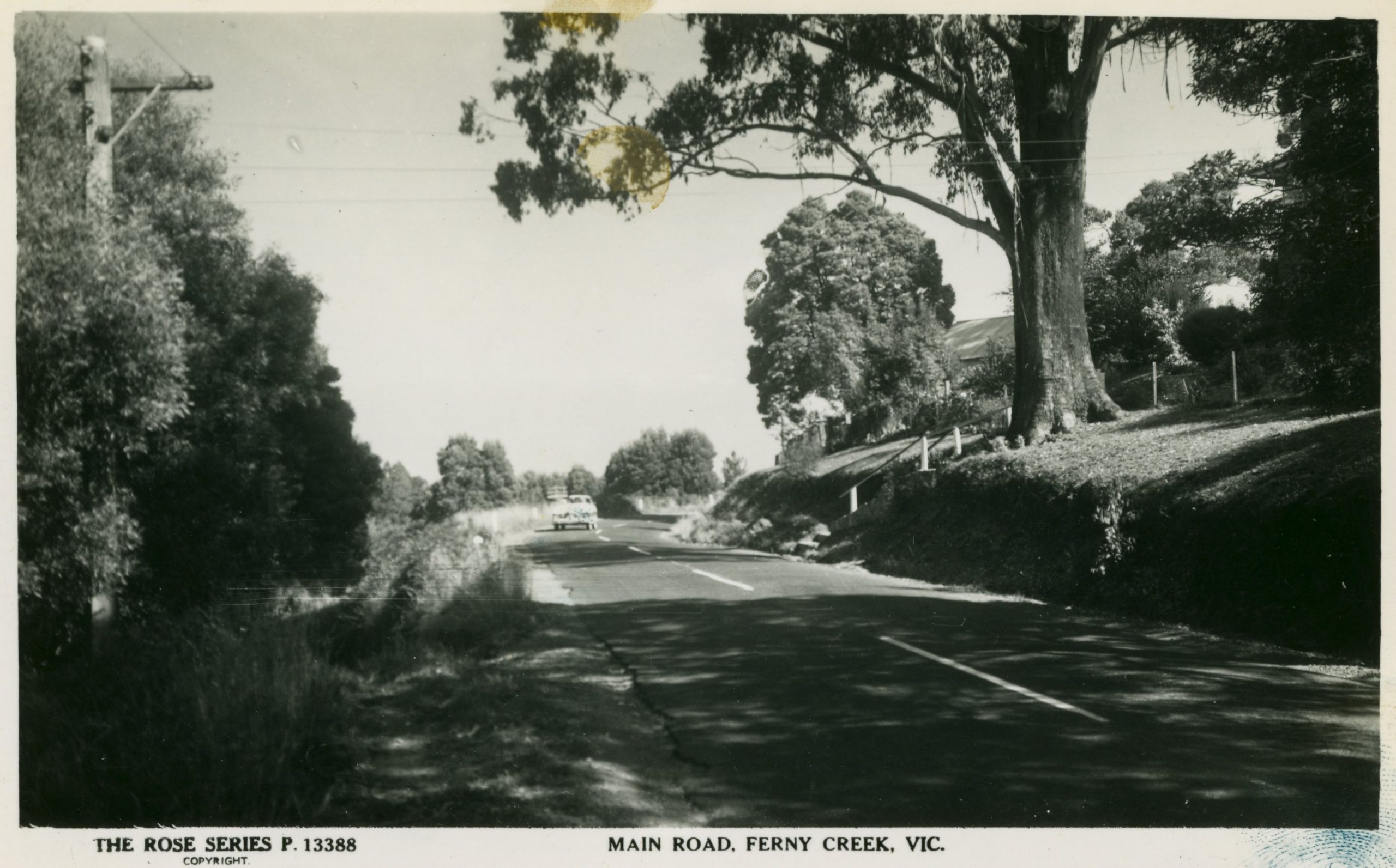
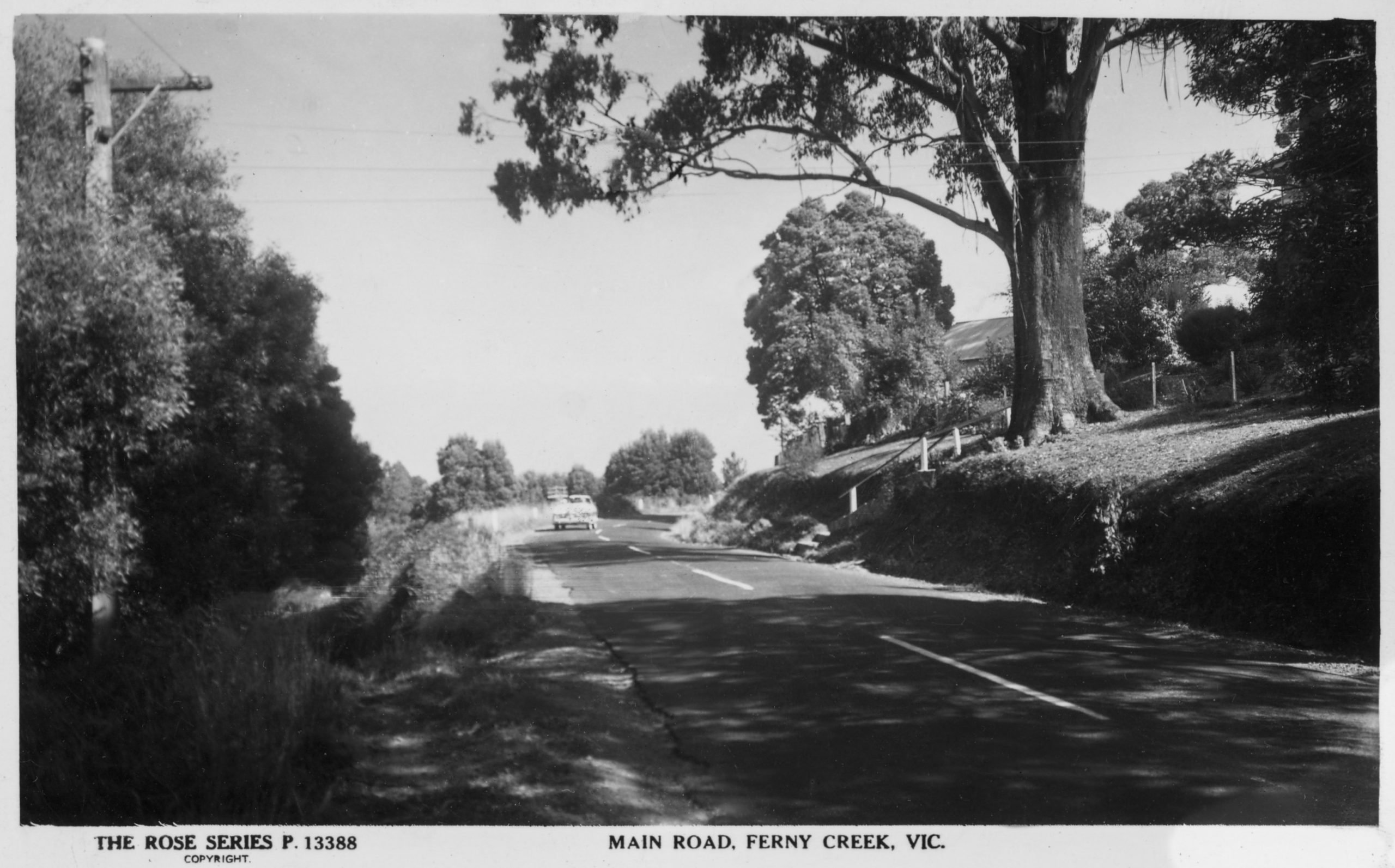
It is possible to restore the tint but it is quite tricky to get a good match with the original. It is, however, very simple to tint a photo so long as I am not trying to get an exact match. Below is an example of a matched tint, not quite correct but ok unless one is a purist, followed by one tinted with the traditional sepia tint.

Whilst scanning the photos, I have come across a few issues and could use some guidance from the society on how to proceed.
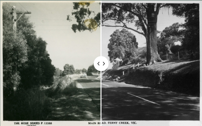
In all the images below, you can move the slider from side to side to compare the 2 images.
Descreening
Screening is an effect created by some types of printing of photos. It is not generally visible but most certainly becomes an issue if the photo is blown up to a large size or if it is subsequently printed at a different resolution when it can lead to nasty moiré patterning effects. Descreening is something that I can do whilst scanning that smoothens out and removes the appearance of halftone dot patterns in scanned images. The downside is that it can slightly blur the photo. This is not usually noticeable as you can see from the two images of St. Michael’s below.

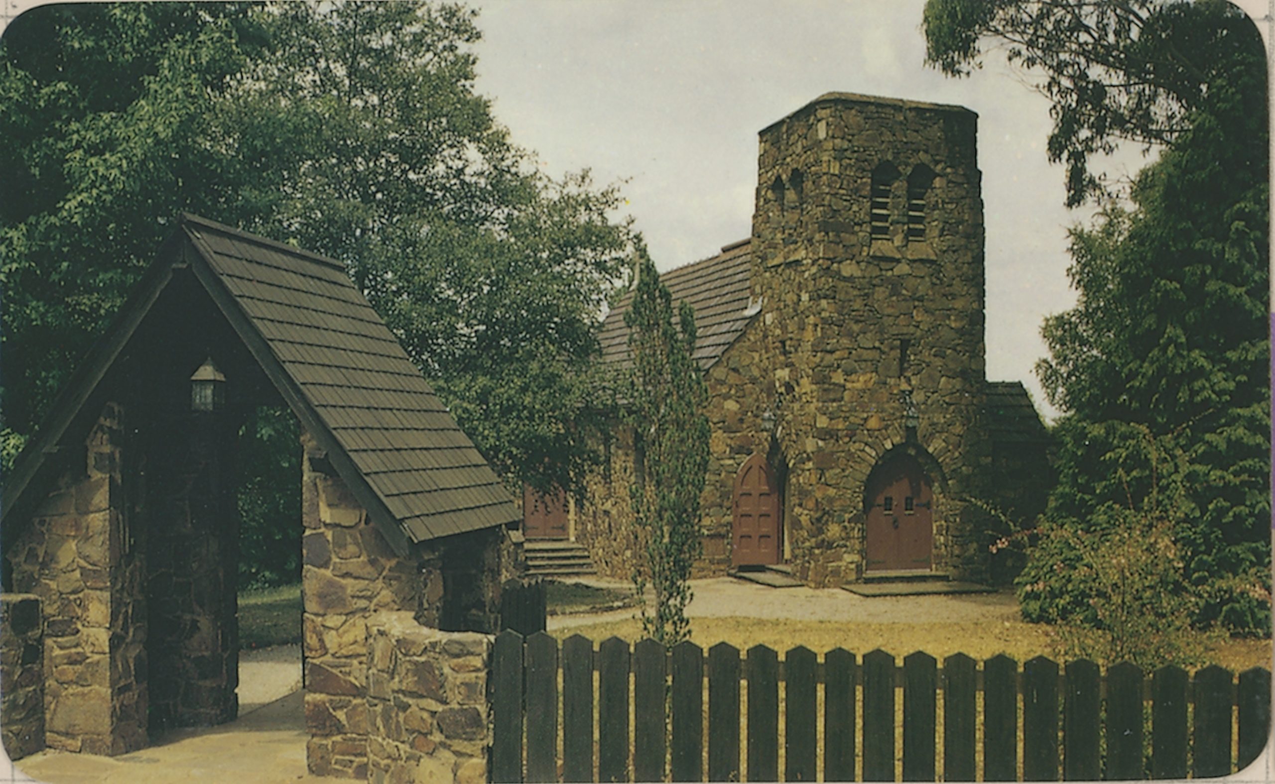
Below are two zoomed in sections of the same images that make it very clear what is being changed and why. On the left-hand side, the screening pattern is clearly visible.
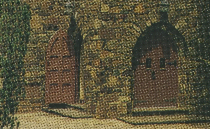
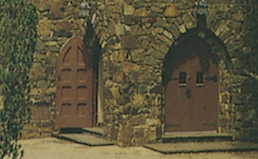
So, should I descreen as a matter of course, or not? Otherwise, I can scan twice, once with descreening and once without. The overhead is just that I have to scan each photo twice. Note that the screen pattern is only on those photos that have been printed using a screen printing process. Fortunately, the Rose series postcards are not affected.
Enhancement
The images above are straight out of the scanner with no major image processing applied. Using various tools, mostly in Zoner photo studio that I mentioned at the last meeting, I can make various changes to the scanned images as illustrated below. In this image, I have removed some noise, altered the brightness and contrast and filled in the missing rounded off corners.

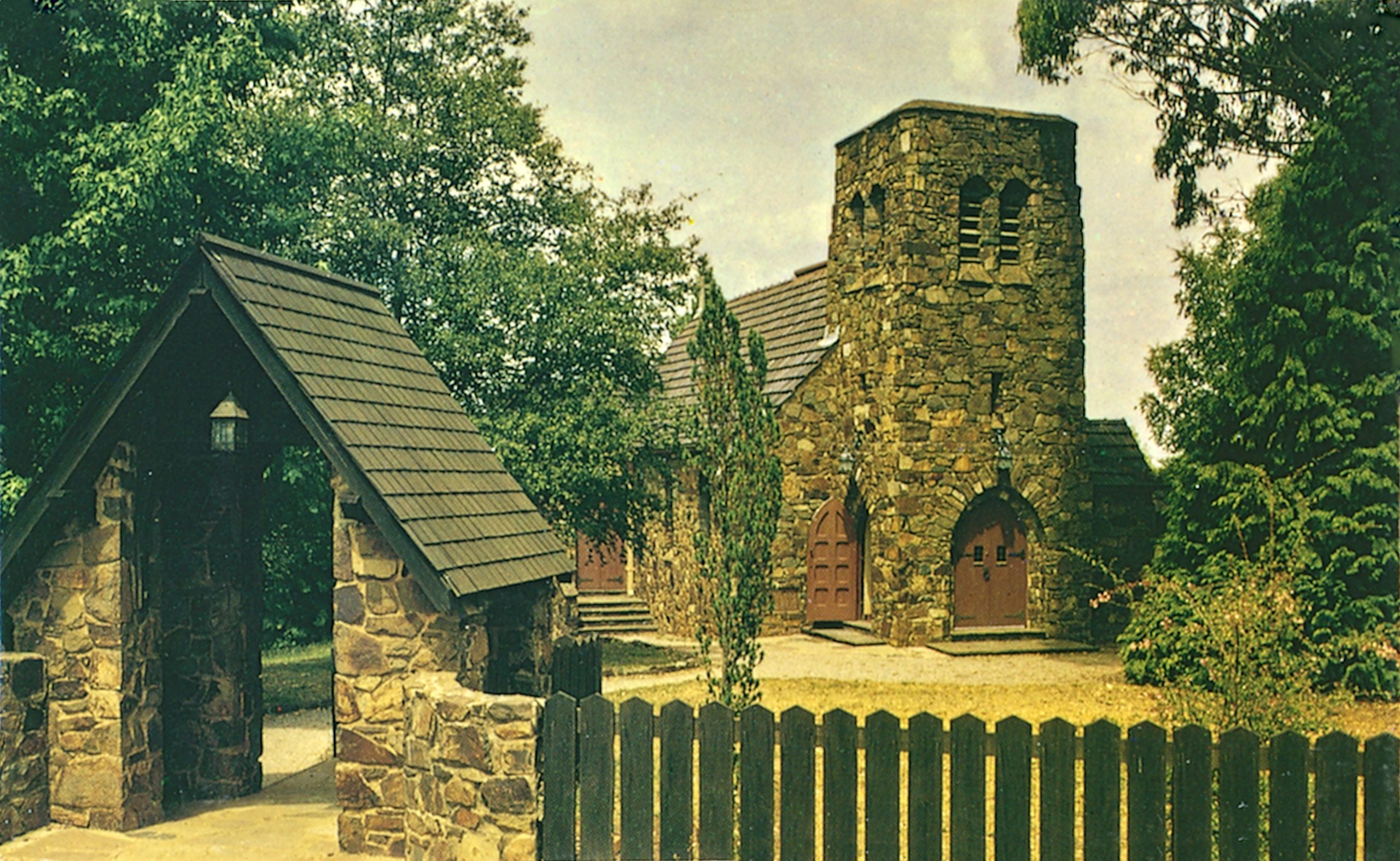
Enhancement like this can vary from requiring a few minutes to hours. In this case it took less than 3 minutes.
Comparing with MDDHS images on Victorian Collections website
I am not at all sure what processes the Victorian Collection system imposes on their photos, but I have done a comparison of one photo that I have scanned with a near identical photo that I found on the Victorian Collections website. The photo in question contains a screening pattern and I have chosen to make this comparison with my descreened version.

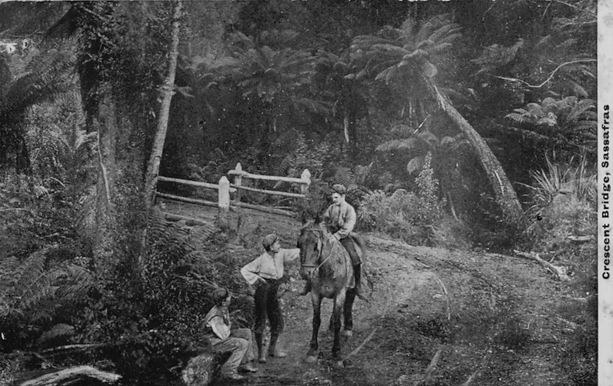
Below are cropped versions of the same image to illustrate the difference when zoomed in. The pixelization and lower resolution of the Victorian Collections image is clearly visible. The reason for this is not clear. It is possible that the original scan was at lower resolution than 600dpi or it may be that the images that are made available to the public via the Victorian Collections website are deliberately displayed at lower resolution.
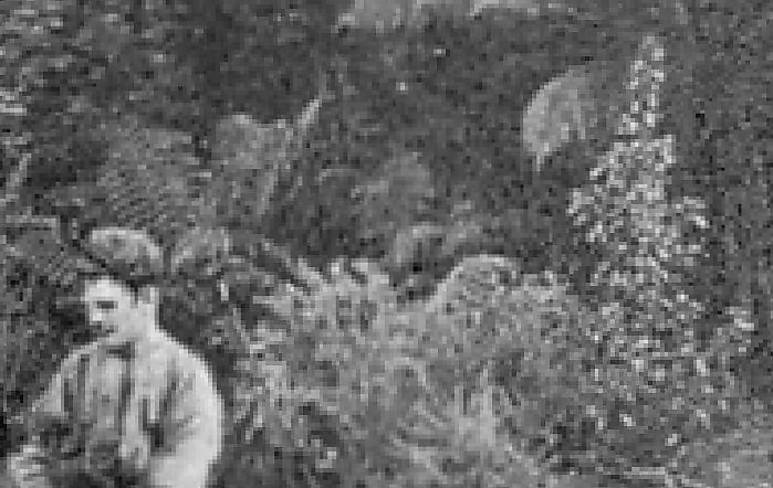
Below is a gently enhanced version of my scan vs the image from the Victorian Collections website.

Leave a Reply